Screen Space
Course: Interactivity
Project length: 2 weeks
Groupwork: 2 students
My role: Project management, Ideation, Visual documentation, Code tinkering
Materials: Node-js, HTML5, CSS3, Javascript, Hammer.js, Mobile device
INTRODUCTION
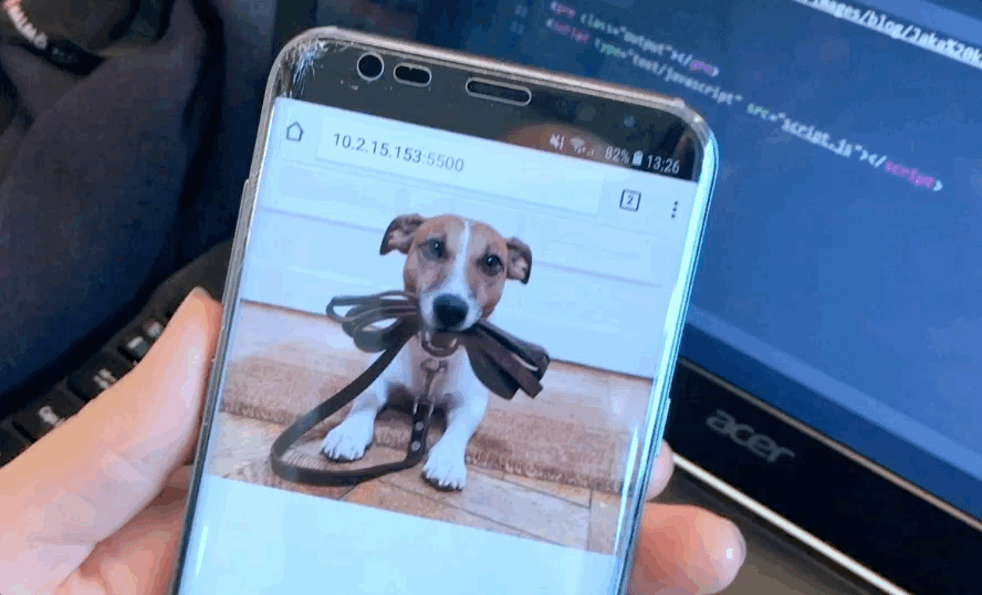
In this course me and a fellow student experimented with screen space on small screens. Our initial question was: How can we work with screens space in a new way? Most of today’s interactions with screens operate mainly with finger gestures, which can be static and still for the majority of our bodies. In this project we explored new possibilities using the accelerometer that are included in most Phones, but a rarely used (with the exception of mobile games) for creating or hiding screen space. We did this with the ambition to create a broader interaction with our most popular device, connecting physical space with digital screen space movement.
What I learned from this project was how to take advantage of already existing and known hardware and explore new possibilities for interaction and communicating around code and interaction.
3 SKETCHES – OUR DESIGN PROCESS
Hide and tilt
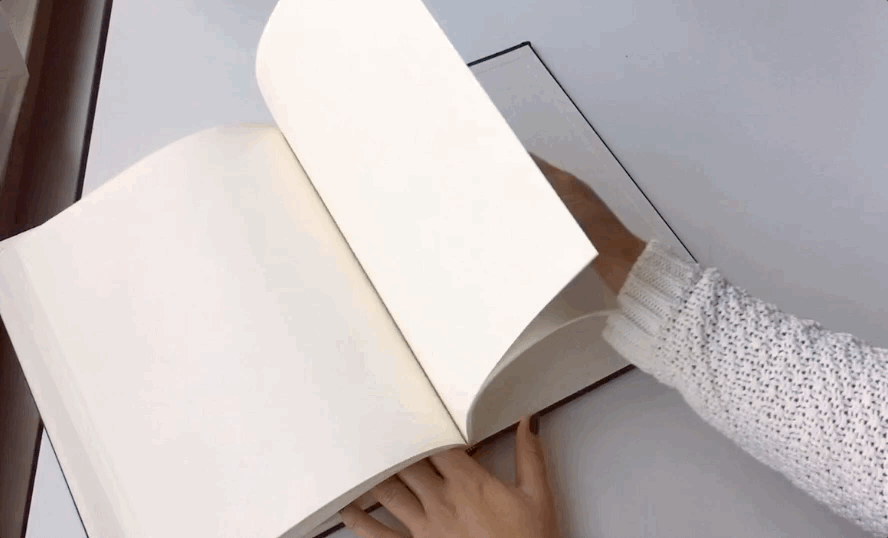
In this first sketch we worked with hiding and showing content with tilting. We took some inspiration from the way we normally search quickly through a book and also looked at apps showing parts of its content, and how they indicate more content outside the screen. We also discovered that the Samsung galaxy s8+ had a similar function.
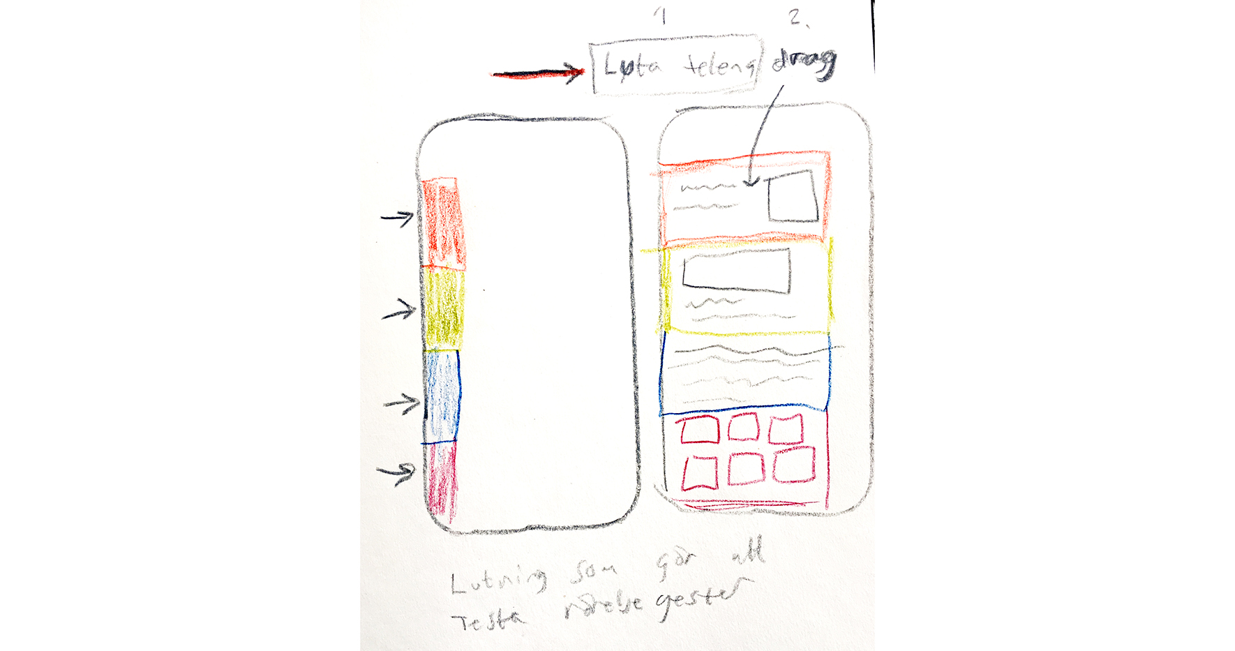
One of my early ideation sketches of Hide and tilt
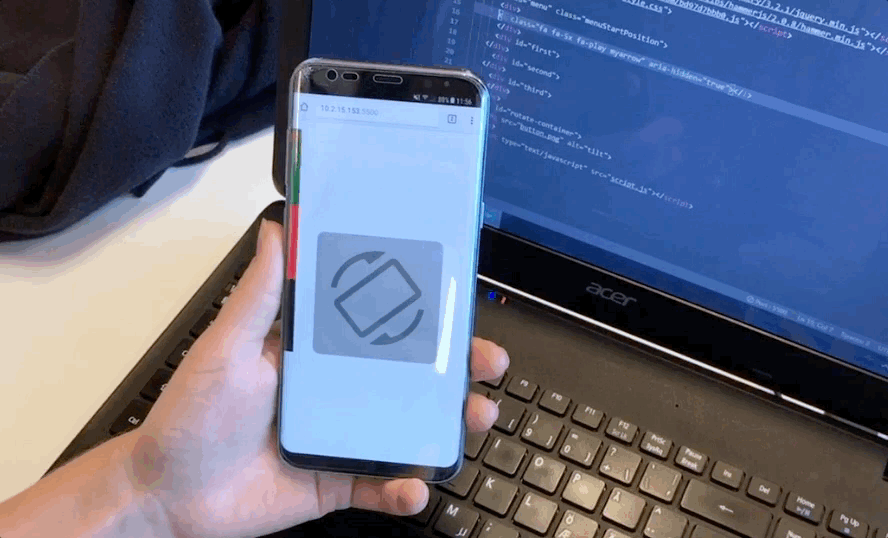
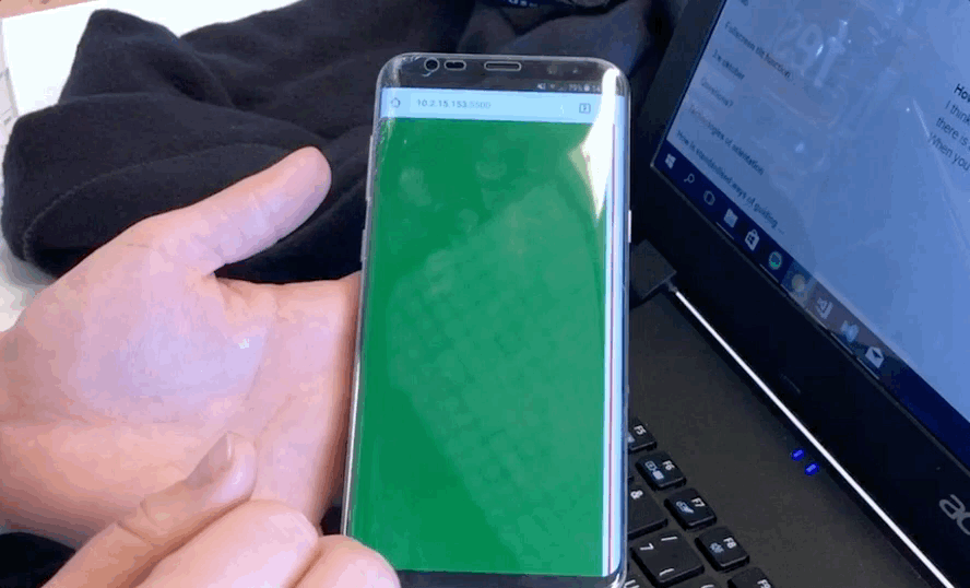
Through the process of developing and prototyping, when performing user testing, we got indications that the interaction could seem too unfamiliar for users trying it out for the first time. We consequently made a small instructive animation as an introduction to how to use it. Once introduced and implemented by the user it would not be needed anymore.
Tilt and stretch
With this sketch we wanted to try if we could add a depth dimension to creation of screen space and to combine tilting with a pinch screen gesture. This would enable the user to stretch and open up a new space behind the first layer.
Tilt and quick scroll
With this sketch we wanted to try if tilting could be used for scrolling through bigger amounts of content. Could that be an interesting way of scrolling through a large image archive?
My insights
I think that this tilt interaction could be useful one, but I see some challenges for it to be commonly used.
- The drop issue, several times when working on the sketches I accidently dropped my phone. For it to work for a wider range of users, we properly have to develop more refined tilting interactions and introduce them over time.
- There is a risk that this interaction could be activated by accident, if not being distinct enough or being used in the right context.
- Since its not familiar interaction, users need to feel at home with the interaction, much like the “search quickly through a book”-example that feel natural doing with a book in the physical world but not doing something similar with a mobile device in your hand using your wrist.