EasyCruit
Course: Internship at Visma
Project length: 1 term
My role: UX designer and researcher
Materials: Balsamiq, Illustrator, Photoshop, pens, papers and post-it notes
INTRODUCTION
As part of the bachelor programme in Interaction Design I did an internship at Visma Labs. Here is a blogpost on their corporate blog about my time there. Visma is a business software and service provider company with around 8500 employees, of which around 100 work with user experience design.
As an intern at Visma Labs I did UX design and research. I was given my own full design project within Visma’s EasyCruit recruitment software, involving supervisors, project owners, ux-designers, visual designers and development managers. I was given a design brief with the aim “ to improve the communication between the company, the manager and the applicants during the recruitment process, including both automatic and manual messaging”. This meant that my task was to, through a design process, find out the best and most effective way to do this.
Information and communication, in the right way at the right time
The most important insight from the design process was that for EasyCruit, as for other successful recruitment processes, communication must be done in the right way at the right time, and through the most appropriate channel. The result of this is a more effective recruitment process enhancing the customer’s employer branding. In order to achieve this for EasyCruit I designed a wizard structure around reminders for each candidate and project, and also an automatic notifications.
THE DESIGN PROCESS
Research (4 weeks)
To really dig into the world of recruitment software I first read up on the research that was done previously within Visma, primarily looking at main flows and key scenarios where and how EasyCruit is used, analyzing competitors and finding out more about the users and their pain points.
To expand on these insights I performed a series of interviews with:
- HR-managers, administrators and recruiters
- Project leaders, consultants and managers
- Newly recruited job seekers and career switchers
- Employment officers
- Students
From the insights from the research phase I created a new design brief for the project and had meetings with my supervisor, the project owner, ux-designers, development managers in order to inform them about my findings and the way to move forward.
Examples of my findings
One thing Visma wanted me to find out from my interviews was the relevance of e-mail as opposed to communicating through social media when recruiting. Competitors use social media and as it is used by everyone everywhere maybe e-mail is old and irrelevant?
Unexpectedly I found that job seekers prefer email over communicating through social media platforms. Apart from LinkedIn, social media is something the people I interviewed preferred to keep personal and not associated to recruitment or job searching. I also discovered that there are gender issues associated with LinkedIn, women get harassed and hit on by men when having their profile there.
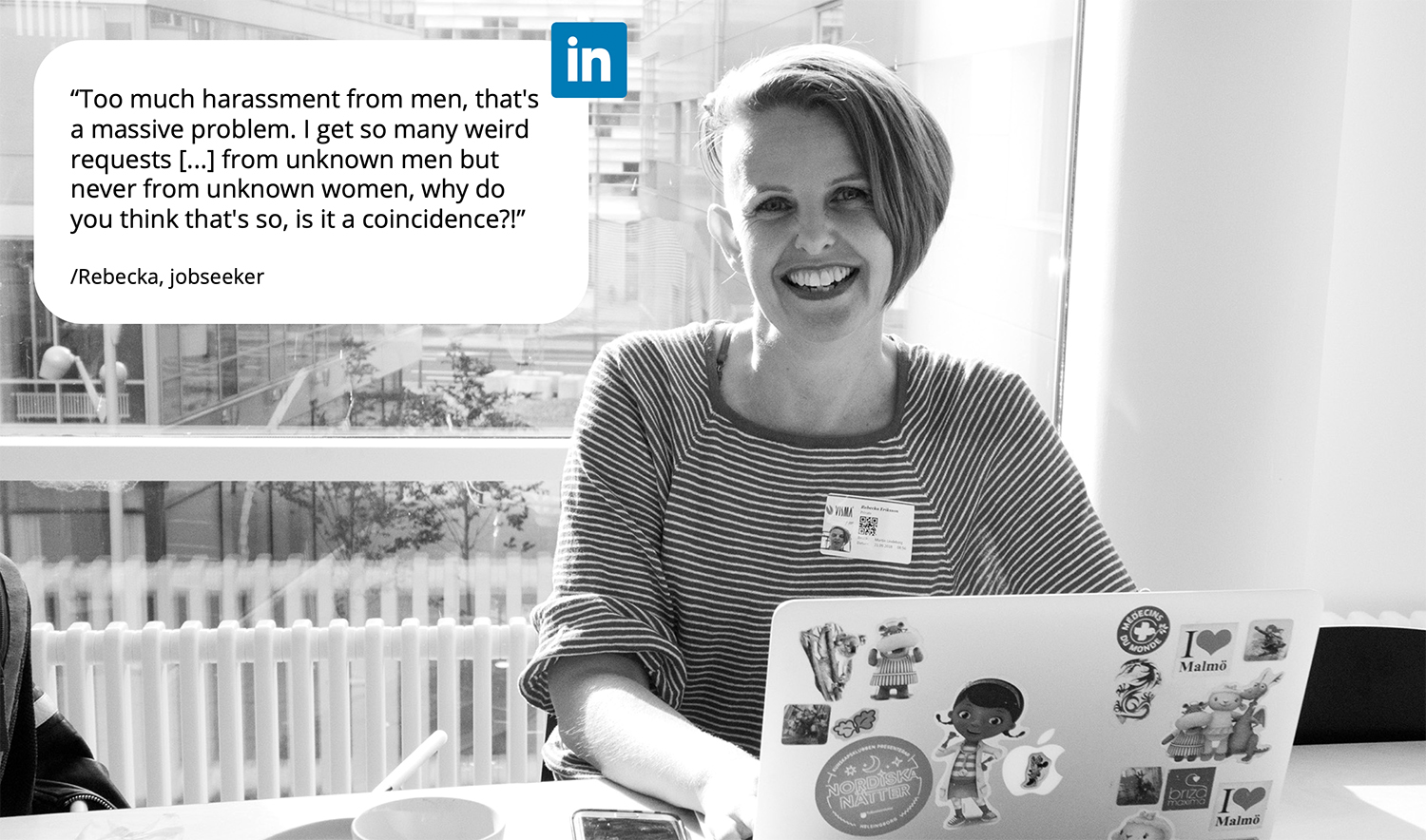
This means that communicating through the latest social media platform may not be as important as you would expect for a good recruitment experience. The fact that communication happens in the right way at the right time is more important. Another major pain point I found was that managers often are “seldom users” of EasyCruit, and tend to go out of the system to known solutions like calendars, papers and email meaning that the workflow ends up unstructured and scattered. This could result in a lengthy and unstructured recruitment experience affecting the company’s employer brand.
Designing (8 weeks)
For my design I worked out some key principles to keep in mind when designing
- Tone and timing. The right kind of Communication should be used at the right time to create a good candidate experience but also for the recruitment process at large.
- Support communication structure. Who does what and when is an important factor.
- Push instead of pulling. It’s more important to get a friendly push to act rather than the system pulling you.
- Time. Candidates should be notified of important steps in the recruitment process within a given timespan.
- Overview flow. It should be quick and easy to view relevant changes and comments without hindering main tasks.
- Next step. Taking the next step in a recruitment process should feel secure and safe to do, and the user should feel like being in control of things, and that the next step is predictable.
I was asked to design within the current solution for EasyCruit being developed and try to incorporate their Nordic Cool – design system. I started out doing paper sketches.
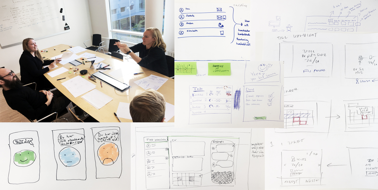
I also organized a design studio-session with the UX designers at the Malmö office to initiate some ideas around these principles.
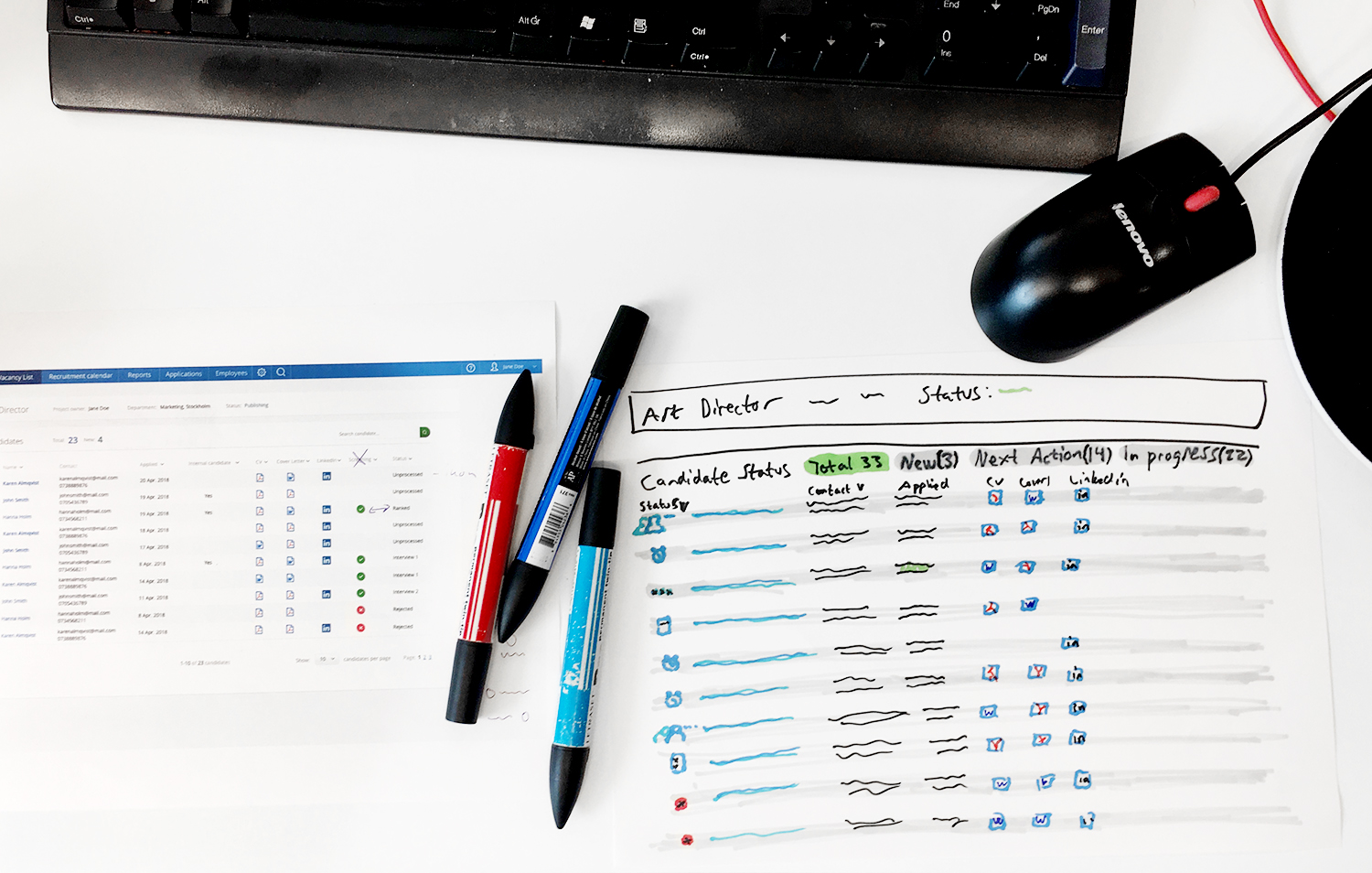
Balsamic sketches and low-fi prototypes
Then I continued designing in Balsamiq and made low-fi prototypes for user testing that included an overview with reminders, wizard functions and also automated notification system.
In order to take my design further I cooperated with one of Visma’s visual designers who helped out in developing hi-fi designs of my solution that were to be presented for the stakeholders in the project.
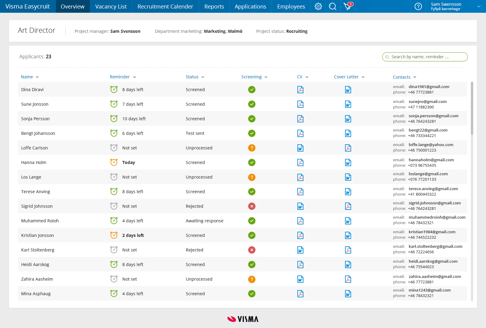
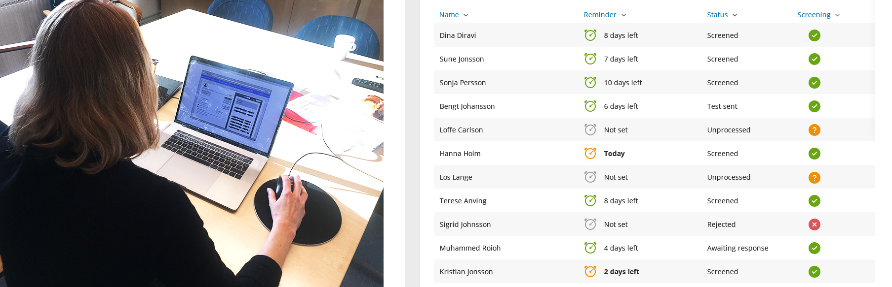
Candidate overview with reminder column marked with different color clock icons and font versions to give the user indications on which candidates that need to be acted upon.
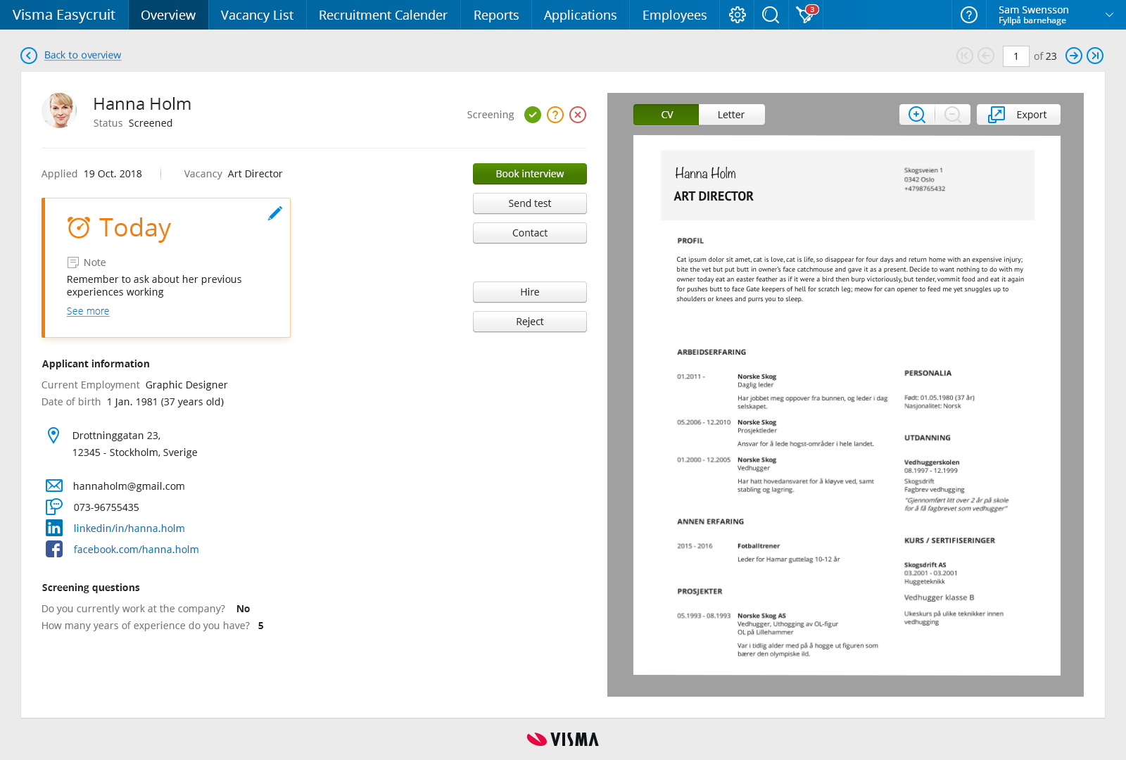
A candidate page with more detail about the reminder and more in-depth information about the candidate. There are also som quick action buttons with the most usual actions you need to perform.
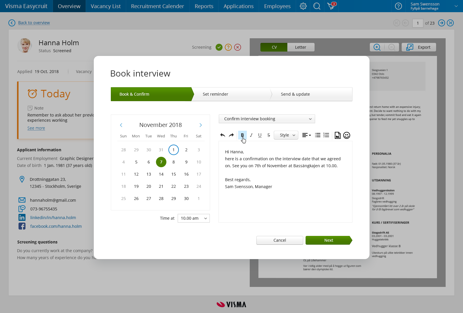
An example of one of the wizards helping the user to communicate and structure the recruitment process.
Evaluating design (4 weeks)
Throughout the design process I made user tests with managers and recruiters to validate my design. Over all they found the right candidate to act on in seconds, this proved that the reminder overview with color grading worked sufficiently.
Over all they found the right candidate to act on in seconds, this proved that the reminder overview with color grading worked sufficiently.
Many of the users expressed that “It is really good that EasyCruit can push you to do the right thing”. Meaning that changing behaviour through design is something that the users welcome.